Talking Points
- USD/JPY rebound gains pace
- S&P 500 reverses from key Gann level
- 2013 high influencing the Aussie?
Get real time volume on your charts for free. Click HERE
Foreign Exchange Price & Time at a Glance:
Price & Time Analysis: USD/JPY
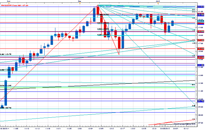
Charts Created using Marketscope – Prepared by Kristian Kerr
- USD/JPY has moved steadily higher since rebounding off Fibonacci support near 118.00 on Tuesday
- Our near-term trend bias remains lower in USD/JPY while below 120.80
- A close under 118.50 is needed to confirm the start of a new leg lower in the rate
- An important turn window is eyed Friday/early next week
- A close over 120.80 would turn us positive on the dollar again
USD/JPY Strategy: Like selling on strength against 120.80.
Instrument | Support 2 | Support 1 | Spot | Resistance 1 | Resistance 2 |
USD/JPY | *118.50 | 119.40 | 119.80 | 120.00 | *120.80 |
Price & Time Analysis: S&P 500
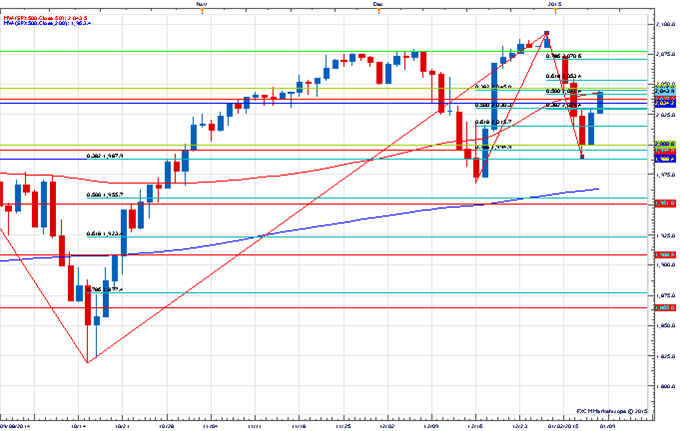
Charts Created using Marketscope – Prepared by Kristian Kerr
- S&P 500 has turned higher after testing key support around 2000 on Tuesday
- Our near-term trend bias is higher while above 2000
- The 1st square root relationship of the all-time high at 2046 is key near-term resistance with traction above needed to re-instill upside momentum
- A minor turn window is seen on Friday
- A close under 2000 would turn us negative on the index
S&P 500 Strategy: Like the long side while above 2000.
Instrument | Support 2 | Support 1 | Spot | Resistance 1 | Resistance 2 |
S&P 500 | *2000 | 2029 | 2040 | *2046 | 2053 |
Focus Chart of the Day: AUD/USD
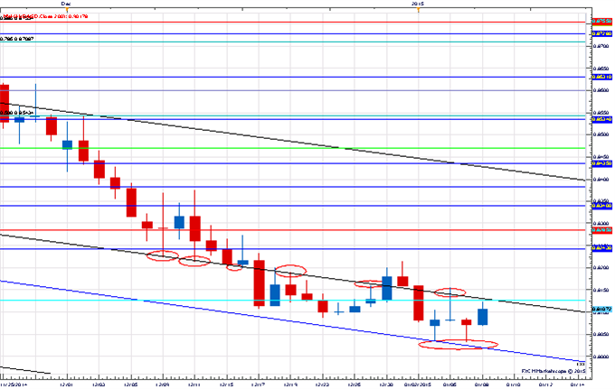
I often get comments from readers on my charts. Some like them, while others complain about how cluttered they are. I will readily admit that they are pretty cluttered, but it is clutter with a purpose. I believe wholeheartedly in the concept of confluence when analyzing the x-axis of time and the y-axis of price. The way I see things the more techniques I can find converging on a price point the better. Maintaining these charts can be quite tedious, however, and often times lines here and there will be overlooked and forgotten. Occasionally these oversights will re-appear and produce some interesting symmetry. Take the Aussie for example. Over the past few weeks the exchange rate has been banging around a median line (black line on chart) that extends all the way back to the early 2013 high! Then earlier this week the pair found support at a Gann line (blue line) related to you guessed it the 2013 high. As Gann would say the 2013 high certainly seems to be “vibrating” with price at the moment.
To receive Kristian’s analysis directly via email, please SIGN UP HERE.
This publication attempts to further explore the concept that mass movements of human psychology, as represented by the financial markets, are subject to the mathematical laws of nature and through the use of various geometric, arithmetic, statistical and cyclical techniques a better understanding of markets and their corresponding movements can be achieved.
--- Written by Kristian Kerr, Senior Currency Strategist for DailyFX.com
To contact Kristian, e-mail kkerr@fxcm.com. Follow me on Twitter @KKerrFX
original source


